

Flor amor is a flower delivery app for iOS, it provides customers with an easy and convenient way to browse and order a wide variety of fresh flowers, plants and gits.
Duration: 5 months.
Methods: Surveys, Interviews, Card Sort, Affinity Mapping, Preference Test, Wireframes, Prototyping.
Tools: Miro, Cjm, Jira, Figma, Illustrator.


After a long and exhausting workday, there may not always be the desire or opportunity ro go to a flower shop to buy a fresh bouquet of flowers. However, with the use of a mobile device and a flower delivery app, you can easily and quickly order a bouquet online, regardless of whether there is a florist in your city or not.
The solution to the problem of creating a flower delivery app is to create a convenient and user-friendly product that helps users quickly and easily find the products they need and order.


Competitor Analysis
To get a better understanding of the competitor landscape, I conducted analyses on the most popular flower delivery apps on the market, and found that while both provided a wealth of information for users to read through, pricing strategies, product features, distribution channels and customer feeback.
Key Findings & Insights
The surveys and interviews helped me understand more about the needs and frustrations of my users, and I was able to pull a few key findings that would help shape my project:

Mid - Fidelity Wireframes
Since simplicity and ease of use are one of the biggest aims of Flor amor, the number of screens were kept to a minimum and I wanted to focus on highlighting the core features. I started with pen and paper wireframes, and created multiple versions of each screen until I found a combination of features and elements that I thought matched the users needs and that would be as intuitive as much as possible.

Usability Testing
This phase was the game changer - by conducting usability tests, I was able to refine what users were finding useful, and completely change up what they didn’t react well to. The users were asked complete a few scenario-based tasks that would test the main features of the app, and were asked how they felt about the app in general. The results of the usability tests were recorded and analysed using a rainbow spreadsheet and an affinity map.
Key Findings
I made notes of the positive and negative feedback, so that I knew what areas to keep expanding upon and what needed to be reworked.
Positive
1. Users were able to complete tasks quickly.
2. Users enjoyed the concept of different filters and categories.
3. Navigation proved easy for users to understand.
User Stories
Finally, I created user stories that I could use to better understand the potential needs of the users, to help decide on the functional requirements for Flor Amor, and that I could refer back to throughout the project to keep focused.
Problem Statement
After a long and exhausting workday, there may not always be the desire or opportunity ro go to a flower shop to buy a fresh bouquet of flowers. However, with the use of a mobile device and a flower delivery app, you can easily and quickly order a bouquet online, regardless of whether there is a florist in your city or not.
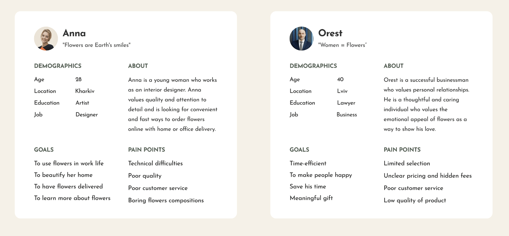
User Personas
Introducing to our main personas, who will help us understand better our users. Let´s start looking at our user persona in-depth.
Customer journey map
To get a better understanding of the journey a customer has to go through, I used CJM which helped me visualize and analyze the path that a customer takes from the initial interaction with the product or service to achieving their end goal.

Let´s take a closer look
Now, let´s take a closer look at an example of user flow for this product to see how it works in practice.

Negative
1. Users were confused with the shop layout.
2. Users had some trouble finding information.
3. Users found text and icons to be too small.
After many tests and iterations, my final product aligned with all of the objectives I had set in place - it includes the three core features necessary for users to find flower bouquets quickly and easily, while appearing visually appealing and simple to use.


On boarding screens
On boarding screens

Home screens

Design System Language
Lastly, I created a design system language that could be followed in the future to ensure consistency throughout the app.


Shopping cart

Design System Language
Lastly, I created a design system language that could be followed in the future to ensure consistency throughout the app.


